Fruit Nation
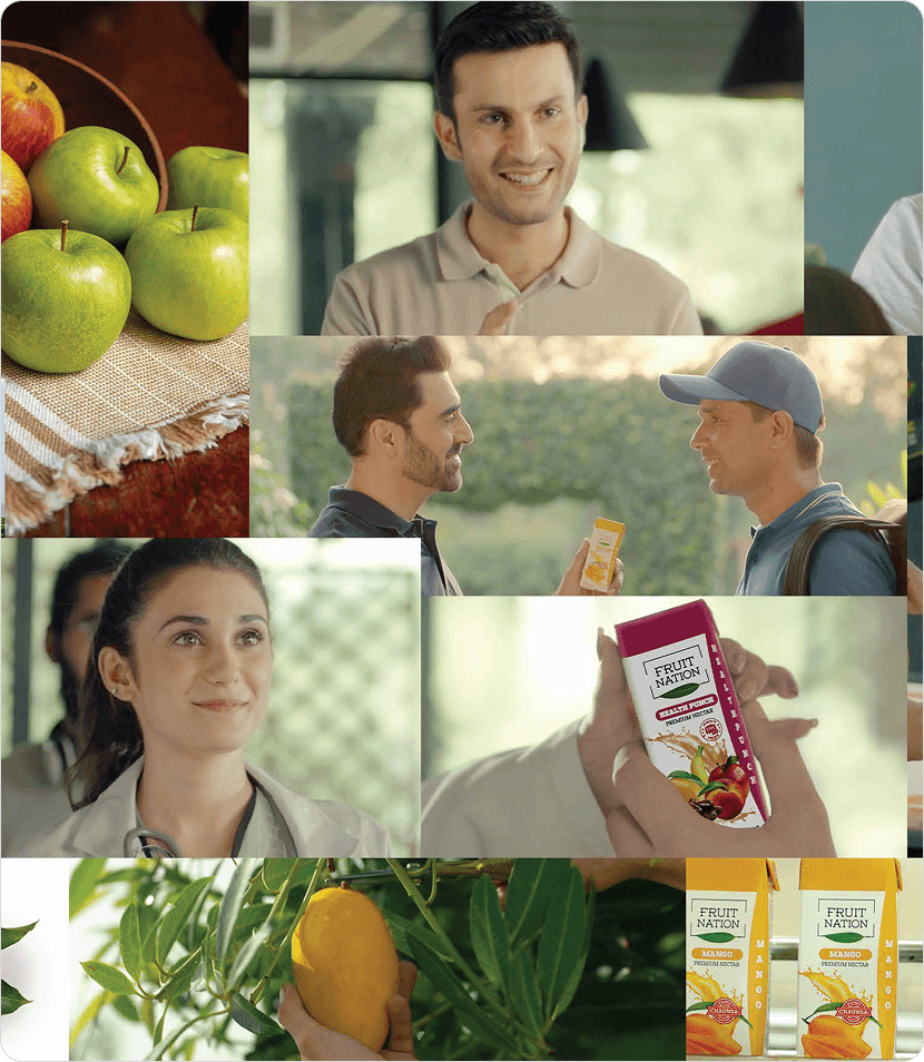
Brand IdentityFruit Nation entered the market with a simple ambition: to make fruit drinks feel fresher, cleaner, and more contemporary. In a category dominated by loud, cluttered packaging, the opportunity was not to shout louder it was to create clarity.
We developed a brand identity built around confidence and restraint. The logo combines modern typography with a subtle organic cue, creating a visual language that feels premium, approachable, and unmistakably fresh. Every element of the system was designed to scale consistently across packaging, retail environments, marketing, and digital touchpoints, allowing the brand to grow without losing recognition.
Scope of Services
- Brand Strategy
- Brand Identity Design
- Logo Design
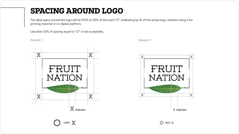
- Brand Guidelines
- Packaging Design System
- Portfolio Architecture
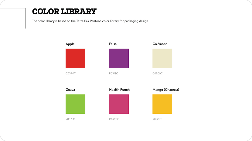
- Typography & Color System
- Visual Identity System
- Marketing Collateral
- Retail Brand Assets
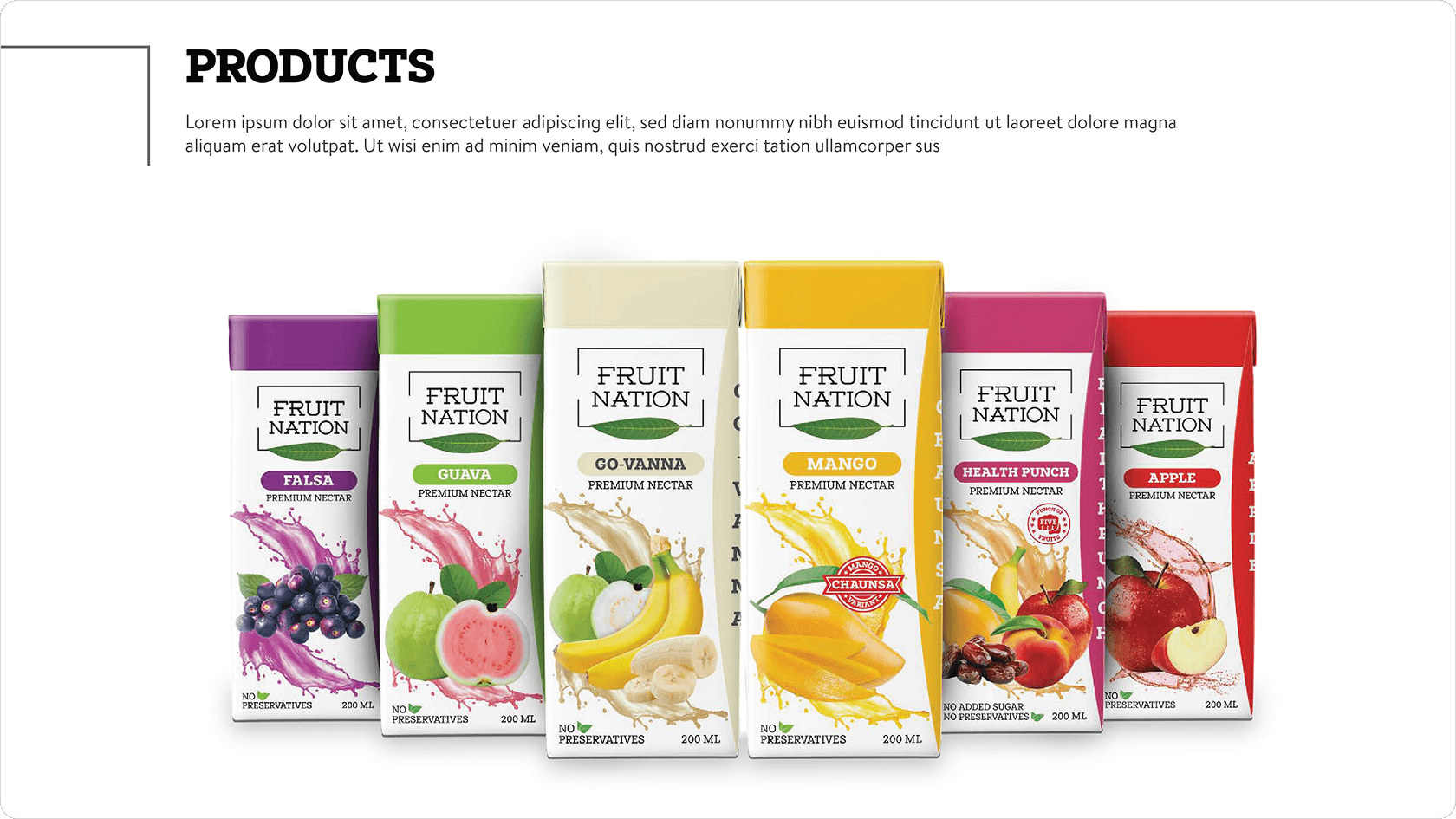
The identity became the foundation for a complete portfolio architecture, enabling multiple flavors to live under one unified brand while maintaining strong shelf impact. Simple enough to be timeless, distinctive enough to stand apart, Fruit Nation now carries a visual identity that reflects the quality of the product and supports its ambition in both local and international markets.